Independence Day brings an American icon to the Clark Art Institute with the arrival of
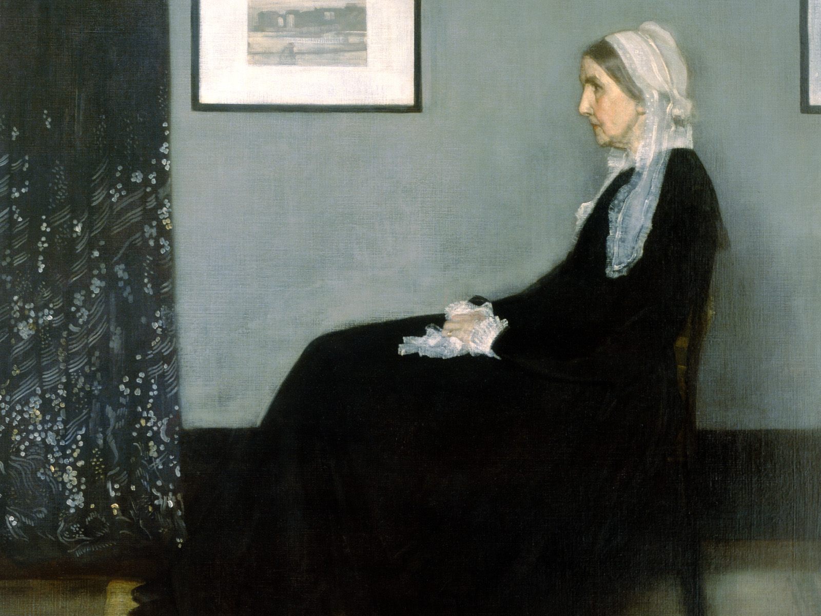
Arrangement in Grey and Black No. 1 (Portrait of the Artist’s Mother) (1871) by James McNeill Whistler as part of the exhibition Whistler’s Mother: Grey, Black, and White, on view July 4 through September 27, 2015. Better known as Whistler’s Mother, the painting has been owned by the French state since 1891 and is in the collection of the Musée d’Orsay, Paris. It is one of the most renowned works of art by an American artist and is considered by many to be the most important American painting not held on American soil.
The painting serves as the centerpiece of an exhibition featuring a selection of Whistler’s prints and drawings, Japanese woodblock prints that inspired the artist, and ephemera that explore the image’s role in popular culture. The exhibition highlights works from the Lunder Collection of James McNeill Whistler at the Colby College Museum of Art as well as from the Clark’s permanent collection. The Clark is one of only two American venues featuring the painting this year and is the only east coast museum to show the iconic painting.
Whistler’s Mother: Grey, Black, and White is presented in collaboration with the Colby College Museum of Art and the Lunder Consortium for Whistler Studies. The painting has an interesting history of exhibition in the United States. In the 1930s The Museum of Modern Art, New York organized an eight-city tour to raise the spirits of Americans during the Depression. At the time, it was a great source of pride that a painting held in such regard by Europeans was painted by an American.
The Painting
Arrangement in Grey and BlackNo. 1 is considered the high point of Whistler’s career. Anna McNeill Whistler posed for the famous portrait in London in 1871 during a time she was living with her son. The artist exhibited the painting frequently in the decade following its creation. After his mother’s death and facing mounting financial pressures, Whistler sold the painting to the French state in 1891. In 1925 Whistler’s Mother became the first American painting to enter the collection of the Louvre and was moved to the collection of the Musée d’Orsay in 1986.
The painting depicts Anna Whistler dressed in black mourning garb and a white cotton cap, sitting in profile with a lace kerchief in her hands. Her feet rest on a small stool, and behind her is a framed print and a Japanese curtain.
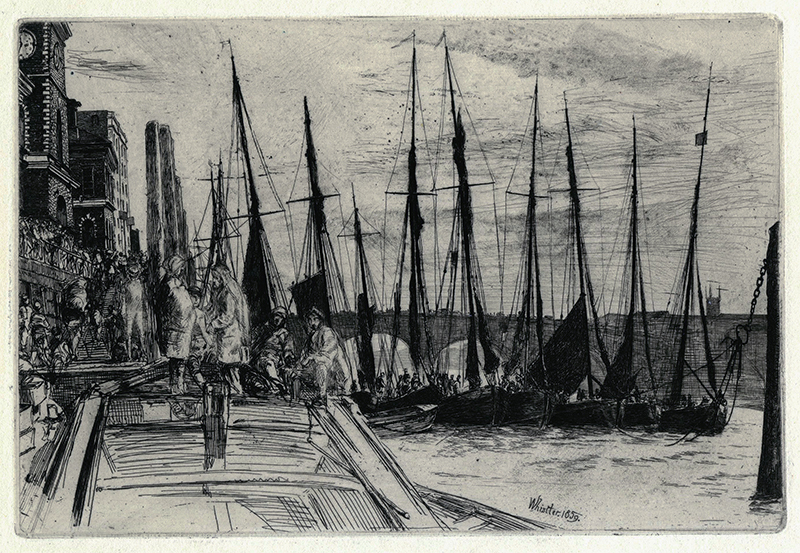
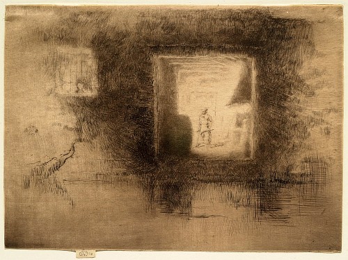
The painting also contains a reference to the location in which it was executed. Whistler’s studio was located in the Chelsea area of London on the River Thames, and the artist was known to frequent the docks in search of views and subjects for portraits.

Black Lion Wharf (1859), the framed print shown in the painting, depicts a scene typical of the type Whistler was creating at the time. The Clark’s exhibition features a print of Black Lion Wharf from the Colby College Museum of Art.
The Exhibition
In addition to Black Lion Wharf, the exhibition includes other depictions of Whistler’s surroundings on the River Thames such as
Billingsgate (1859, Colby College Museum of Art)

and The Pool (1859, The Clark) all of which were later joined into a series known fittingly as The Thames Set and published the same year he created the portrait of his mother.
Another group of works, which grew out of Arrangement in Grey and Black No. 1, were Whistler’s nocturnes. His frequent use of the terms “arrangement” and “nocturne” in the titles of his paintings reflects his interest in the musical notions of harmony and balance, characteristic of the aesthetic art movement.
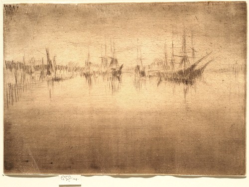
Nocturne Shipping (1879/1880)
Nocturne: Furnace (1879/1880)
These works—represented in the exhibition by two etchings and one lithograph—began as depictions of the River Thames at night and continued during his time in Venice. As Whistler explained: “By using the word ‘nocturne’ I wished to indicate an artistic interest alone, divesting the picture of any outside anecdotal interest which might have been otherwise attached to it. A nocturne is an arrangement of line, form and colour first.” His desire to focus on form and color rather than narrative began with the groundbreaking portrait of his mother.
The composition of Whistler’s Mother reflects the artist’s interest in the Japanese woodblock prints he is known to have collected and admired, and the inclusion of a Japanese textile in the painting reinforces his keen interest in Japonisme. In late nineteenth-century London and Paris, Japanese woodblock prints were widely available and relatively affordable. Many artists of the time, including Whistler, Degas, Cassatt, Renoir, and Monet, were influenced by the Japanese aesthetic. Whistler, as evidenced in Arrangement in Grey and Black No. 1, not only owned Japanese textiles but also collected woodblock prints, including those by Utagawa Hiroshige I.
The exhibition presents a small selection of prints by Hiroshige alongside Whistler’s prints to reinforce their connection. For example, the radical cropping of space in

Whistler’s Rotherhithe (1860, Colby College Museum of Art)
is indebted to the similarly cropped interior/exterior in
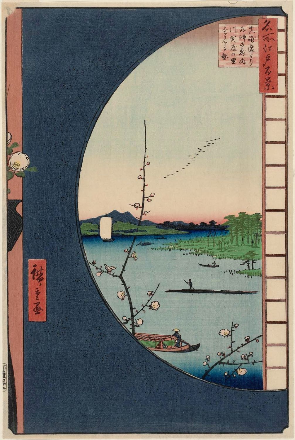
Hiroshige’s View from Massaki of Suijin Shrine (1857, Rodbell Family Collection, The Clark).
While Arrangement in Grey and Black No. 1 is Whistler’s most famous painted portrait, he created hundreds of etchings, lithographic portraits, and drawings of his family, friends, and patrons throughout his life. The exhibition features the portraits
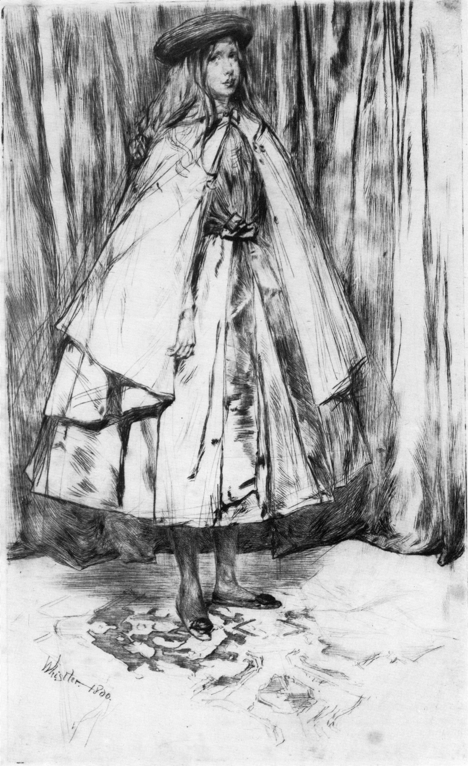
Annie Haden (1860, Colby College Museum of Art)

and Mrs. Leyland, Sr. (1874–1875, Colby College Museum of Art)

and a drawing known as The Sleeper, a portrait of his model Joanna Hiffernan (1863, The Clark) from the artist’s early career when he chose close family and friends as his sitters.
A section of Whistler’s Mother: Grey, Black, and White explores the painting’s role in popular culture and collective American thought by presenting an array of historical and cultural replications and images such as magazine covers, posters, and photographs.
‘WHISTLER’S MOTHER’ ARRIVES JULY 4 AT THE CLARK ART INSTITUTE
For Immediate Release
May 14, 2015
Williamstown, Massachusetts—Independence Day brings an American icon to the Clark Art Institute with the arrival of Arrangement in Grey and Black No. 1 (Portrait of the Artist’s Mother) (1871) by James McNeill Whistler as part of the exhibition Whistler’s Mother: Grey, Black, and White, on view July 4 through September 27, 2015. Better known as Whistler’s Mother, the painting has been owned by the French state since 1891 and is in the collection of the Musée d’Orsay, Paris. It is one of the most renowned works of art by an American artist and is considered by many to be the most important American painting not held on American soil.
The painting serves as the centerpiece of an exhibition featuring a selection of Whistler’s prints and drawings, Japanese woodblock prints that inspired the artist, and ephemera that explore the image’s role in popular culture. The exhibition highlights works from the Lunder Collection of James McNeill Whistler at the Colby College Museum of Art as well as from the Clark’s permanent collection. The Clark is one of only two American venues featuring the painting this year and is the only east coast museum to show the iconic painting.
Whistler’s Mother: Grey, Black, and White is presented in collaboration with the Colby College Museum of Art and the Lunder Consortium for Whistler Studies. The exhibition is generously supported by a grant from The Lunder Foundation and by Katherine and Frank Martucci.
The painting has an interesting history of exhibition in the United States. In the 1930s The Museum of Modern Art, New York organized an eight-city tour to raise the spirits of Americans during the Depression. At the time, it was a great source of pride that a painting held in such regard by Europeans was painted by an American.
“We look forward to welcoming this great American painting to the Berkshires,” said Michael Conforti, the Felda and Dena Hardymon Director of the Clark. “The Clark is indebted to the Musée d’Orsay for the loan of this extraordinary painting which will be the center of one of our summer 2015 exhibitions. The Clark has exceptional works by Winslow Homer and John Singer Sargent, but no major paintings by Whistler, another great American artist of the late nineteenth century. We are delighted to have the opportunity to present it at the Clark.”
The Painting
Arrangement in Grey and BlackNo. 1 is considered the high point of Whistler’s career. Anna McNeill Whistler posed for the famous portrait in London in 1871 during a time she was living with her son. The artist exhibited the painting frequently in the decade following its creation. After his mother’s death and facing mounting financial pressures, Whistler sold the painting to the French state in 1891. In 1925 Whistler’s Mother became the first American painting to enter the collection of the Louvre and was moved to the collection of the Musée d’Orsay in 1986.
The painting depicts Anna Whistler dressed in black mourning garb and a white cotton cap, sitting in profile with a lace kerchief in her hands. Her feet rest on a small stool, and behind her is a framed print and a Japanese curtain.
The painting also contains a reference to the location in which it was executed. Whistler’s studio was located in the Chelsea area of London on the River Thames, and the artist was known to frequent the docks in search of views and subjects for portraits. Black Lion Wharf (1859), the framed print shown in the painting, depicts a scene typical of the type Whistler was creating at the time. The Clark’s exhibition features a print of Black Lion Wharf from the Colby College Museum of Art.
The Exhibition
In addition to Black Lion Wharf, the exhibition includes other depictions of Whistler’s surroundings on the River Thames such as Billingsgate (1859, Colby College Museum of Art) and The Pool (1859, The Clark) all of which were later joined into a series known fittingly as The Thames Set and published the same year he created the portrait of his mother. Another group of works, which grew out of Arrangement in Grey and Black No. 1, were Whistler’s nocturnes. His frequent use of the terms “arrangement” and “nocturne” in the titles of his paintings reflects his interest in the musical notions of harmony and balance, characteristic of the aesthetic art movement. These works—represented in the exhibition by two etchings and one lithograph—began as depictions of the River Thames at night and continued during his time in Venice. As Whistler explained: “By using the word ‘nocturne’ I wished to indicate an artistic interest alone, divesting the picture of any outside anecdotal interest which might have been otherwise attached to it. A nocturne is an arrangement of line, form and colour first.” His desire to focus on form and color rather than narrative began with the groundbreaking portrait of his mother.
“The extraordinary visit of Whistler’s Mother to the Clark this summer allows us to study the painting and to situate it within its historical, aesthetic, and physical context,” said Jay A. Clarke, Manton Curator of Prints, Drawings, and Photographs. “We were fortunate to collaborate with the Lunder Consortium for Whistler Studies on the exhibition. Their expertise and assistance were invaluable.”
The composition of Whistler’s Mother reflects the artist’s interest in the Japanese woodblock prints he is known to have collected and admired, and the inclusion of a Japanese textile in the painting reinforces his keen interest in Japonisme. In late nineteenth-century London and Paris, Japanese woodblock prints were widely available and relatively affordable. Many artists of the time, including Whistler, Degas, Cassatt, Renoir, and Monet, were influenced by the Japanese aesthetic. Whistler, as evidenced in Arrangement in Grey and Black No. 1, not only owned Japanese textiles but also collected woodblock prints, including those by Utagawa Hiroshige I. The exhibition presents a small selection of prints by Hiroshige alongside Whistler’s prints to reinforce their connection. For example, the radical cropping of space in Whistler’s Rotherhithe (1860, Colby College Museum of Art) is indebted to the similarly cropped interior/exterior in Hiroshige’s View from Massaki of Suijin Shrine (1857, Rodbell Family Collection, The Clark).
While Arrangement in Grey and Black No. 1 is Whistler’s most famous painted portrait, he created hundreds of etchings, lithographic portraits, and drawings of his family, friends, and patrons throughout his life. The exhibition features the portraits Annie Haden (1860, Colby College Museum of Art) and Mrs. Leyland, Sr. (1874–1875, Colby College Museum of Art) and a drawing known as The Sleeper, a portrait of his model Joanna Hiffernan (1863, The Clark) from the artist’s early career when he chose close family and friends as his sitters.
The pared-down composition of Arrangement in Grey and Black No. 1 and the familiar image of motherhood make the image easy to replicate and reinterpret. As is the case with Leonardo da Vinci’s Mona Lisa and Edvard Munch’s The Scream, Arrangement in Grey and BlackNo. 1 has been parodied, manipulated, and reimagined. A section of Whistler’s Mother: Grey, Black, and White explores the painting’s role in popular culture and collective American thought by presenting an array of historical and cultural replications and images such as magazine covers, posters, and photographs.